5 Things Every Small Business Website Needs in 2026
Most small business websites are missing at least two of these. Here is the short list that actually turns visitors into customers, and why each one matters more now than it did a few years ago.
We have built hundreds of small business websites, and the same pattern shows up every time we take over an existing site. The design is usually fine. The problem is that the site is missing one or two fundamentals, and those gaps quietly cost the business customers every day.
Here is the short list. If your site has all five, you are ahead of most of your competitors. If it is missing any of them, you know what to fix first.
1. A clear answer to “what do you do, and where?”
A visitor gives your homepage about three seconds before deciding whether to stay. In that window they are asking two questions: what does this business do, and is it for someone like me?
Your headline has to answer both. “Residential and commercial plumbing in Grand Rapids” beats “Quality service you can trust” every time, because the second one could belong to any business on earth.
This is also the first thing search engines and AI assistants look for. When someone asks Google or ChatGPT for a plumber near them, the systems doing the answering are scanning for exactly that sentence: the service and the place. If you make them guess, they will recommend someone who did not.
A quick test: cover everything on your homepage except the headline and the first paragraph. Could a stranger tell what you do and where you do it? If not, that is your first fix.
2. One obvious next step
Every page on your site should have a single primary action, and it should be impossible to miss. Call us. Book online. Get a quote. Pick one per page and make it the most prominent element on the screen.
The mistake we see most often is offering everything at once: a phone number in the header, a contact form in the sidebar, a newsletter signup in the footer, three different buttons in the hero. When everything is emphasized, nothing is. Visitors who are not sure what to do next usually do nothing.
The second mistake is hiding the action behind a click. If your phone number lives on a Contact page, most mobile visitors will never see it. Put it in the header, make it tappable, and repeat the primary action at the bottom of every page where a visitor might have made up their mind.
3. Speed that passes Google’s Core Web Vitals
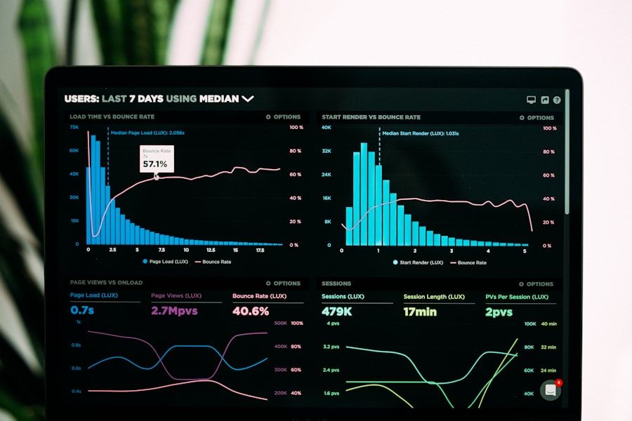
Google measures how fast your pages load and how stable they are while loading, using real data from real visitors. These measurements, called Core Web Vitals, are a ranking factor. A slow site does not just annoy people. It ranks lower.
Speed also affects conversions directly. Every extra second of load time costs you visitors, and the effect is worst on mobile, where most of your traffic comes from and where connections are least reliable.
You can check your own score for free at Google’s PageSpeed Insights. Anything under 90 on mobile is costing you. We build every site to score 95 or higher and guarantee it, because the fix is structural: static code delivered from a global edge network, with no bloated plugins or slow database in the way. Speed is not something you bolt on later. It is a result of how the site is built.
4. Proof that real people chose you
Nobody wants to be the first customer. Before a visitor calls, they want to know that someone like them already did and was glad they did.
The proof that works is specific. Real reviews with real names and, where you can, real faces. Photos of actual work, not stock images of smiling strangers. A count that shows scale, like the number of reviews on your Google profile. A five-star rating with a visible review count is worth more than any paragraph you could write about yourself.
One warning: never fake it. Stock photos beside “customer” names, invented testimonials, or a padded review count will be noticed by exactly the careful visitor you most want to convince. Real proof is easier to get than most owners think. Ask your happiest customers, and put what they say on the page.
5. Structure that machines can read
This is the one almost every small business site is missing, and it is the one that matters most going forward.
Search engines have always read your site by its structure, not its design. Now AI assistants do too, and they are much less forgiving. When someone asks ChatGPT, Gemini, or Google’s AI Overviews for a recommendation, the assistant needs to understand your business well enough to describe it and cite it. That requires:
- Schema markup that spells out your business name, services, location, hours, and reviews in a format machines trust.
- A sitemap that stays current automatically, so every page is found.
- Semantic HTML, meaning headings, lists, and sections that mean what they say instead of a soup of generic boxes.
- An llms.txt file, a plain-text summary of your business written for AI assistants, which is fast becoming a standard.
Google now grades a site’s readiness for AI agents inside PageSpeed Insights, under a category called Agentic Browsing. It checks three things: a sound accessibility tree, layout stability, and that llms.txt file. Most sites built more than a year ago fail at least one. Every site we build passes all three by default, because this is the direction the web is heading, and a site that machines can read is a site that gets recommended.
Where to start
If your site is missing one of these, fix it in the order above. The headline is a copy change you can make today. The next step is a layout decision. Speed and structure are usually build decisions, which is why we include them on every plan rather than selling them as upgrades.
And if your site is missing three or more, it is probably faster to start fresh than to patch it. We will show you what that looks like with a free mockup of your new homepage within 24 hours, and you pay nothing until you approve it.